Tuesday, 31 March 2015
OUGD401 How to Write Correctly (Study Task Six)
From going to the library and looking through two dissertations, it became apparent that I should spell check my essay, but not only rely on spell check, I should also read through my essay to make sure that it makes sense, but also get other people to read through it and check it too. I have also learnt that an essay is successful if it is well planned and well structured, something I will have to do with my own essay - maybe breaking the essay up into sections and re-ordering them, as I think my essay is all over the place at the moment. It was also clear that I have to do thorough research into my topic as this would help me plan and write my essay. I also need to try to get rid of my own opinions in my essay and just use solely facts.
Tuesday, 24 March 2015
OUGD401 Yes Logo Analysis
To get an idea of some products that are branded successfully, I went to the library and looked into logo design. I particularly liked the book 'Yes Logo' as all of the branding inside was really slick and minimal. The page below shows designs created by Michael Peters for the International Coffee Organisation in 1981/82. I think the design is incredibly successful as the logo is based on the pouring of milk into coffee, so is therefore very relevant for the brand. The contrast of the black and white works really well as it's very contrasting and bold.

I also really liked this page based on the logo for Nabarro, a prestiguous law firm. I think the logo is incredibly friendly as a sans serif typeface is used which makes it seem very open and calming. The actual logo design is made up with multiple paths to form an 'N' in an artistic way. The colours used make the book pop out as they're very contrasting.

Saturday, 21 March 2015
OUGD401 In-Store Research
I went to the shop to do some in-store research of possible products that I could rebrand. I found that micromeals/instant meals are generally branded very poorly. They go for a post-modern style which isn't exactly bad, but they're quite difficult and harsh on the eyes. I think it would be quite interesting to try to rebrand a minimal microwave meal, and possibly aim it at a specific audience, e.g. students.

I then found this box of chocolates. I don't actually understand the branding and packaging, as the flowers and butterflies have no relevance what so ever to the product. It would be interesting to rebrand this product, however I don't think I want to as I'd be quite limited with what I could create.

I then found this pot of soup. I think the idea for the branding is quite nice and successful, as you can see the soup through the see-through chicken, however I don't like the typography used at all and I think the colour scheme is pretty gross. I don't think this would be a good product to rebrand as it's almost successful as it is.

I then went down a different isle and found this coffee mate. I think the branding is quite successful as the colour scheme makes it look desirable, however I don't think the logo fits very well and it could've been positioned a lot more successfully.

Finally, I found the tins and had a look through them. I think one of the worst branded tins was spam as the colour scheme was awful, as was the layout and design in general. I think that I want to take this product forward to rebrand as there is quite a lot I could do with it as it is meat - maybe even try to rebrand it as a frozen food such as Pate.

Wednesday, 18 March 2015
OUGD401 Interim Crit
In the interim crit, we were asked to explain our current idea to other people in our group to see if they thought it was relevant to our essay.
I told people that my essay was based on consumerism in America and discusses how consumerism changed in the 60s due to the economic crash, and how it became more about a brand than it was about the product, which is still visible today, such as with Apple and Topshop.
I told people my idea of how I wanted to rebrand either Augason Farms or Great Value. I also told people how I found it quite hard to come up with an idea, as I can't exactly walk into an American shop and see what they have to offer other than American Sweet Shops. People said that they thought that rebranding Great Value would be a good idea, however they didn't really understand my reason to do it. I thought about this and it would be to prove that it is about branding and packaging more than it is about the product.
I asked Simon about my idea and he said that I should look into rebranding a product that is in the USA but not in the UK. He also suggested that it doesn't specifically have to be an American product to prove that branding is more important than the product, as it is a worldwide concept, not just in America. I think this is actually really helpful advice, as I found it really difficult to research into the products.
Thursday, 12 March 2015
OUGD401 Product Research
I told Simon about my ideas and he thought the best idea was the idea to rebrand a product that already exists, as did a lot of people that I spoke to about it in the group crit. I thought that one of the best ways to find products that were designed badly was to look online at ASDA. As my essay is based on American Consumerism, I decided I would rebrand a product that exists in America, but maybe not in the UK.
I started by looking online at the equivalent of ASDA in the US; Walmart. I found quite a few products that don't really exist in the UK, such as Butter Powder. This particular product is from a brand called Augason Farms. I decided to research into this brand. I think the branding is relevant for the product, however also not as the name of the brand and the logo suggests that the products are organic and free range, however the actual product is very processed. The products are all generally packaged in the same way - simplistic. I think the minimal style of packaging is very useful, especially in products like this as they are long-life products and they don't actually really need a brand, just a simplistic label. I think that Augason Farms realised this, however tried to make their products into a brand - which I think could've worked, however the style they have used is very unsuccessful. For example, I think the contrast of the logo against the blue works, however I really don't like the gradient used and I think the contrast of the red label and the blue is an eyesore and very ugly to look at. I also think the three, possibly four different typefaces used is disgusting. There's a script, a serif, a sans serif and possibly a condensed sans serif. There's an awful lot going on and the script typeface is not very legible. I think the use of the serif typefaces is effective, however put together with two different sans serif typefaces makes it look very outdated.
I considered rebranding the product, possibly aiming it at students living away from home, as a kind of food package that parents could send their children, however I asked a few people whether they would consider eating it and they all said no. I also looked into if the products in general are healthy, and it was a general no because they are all very processed products.
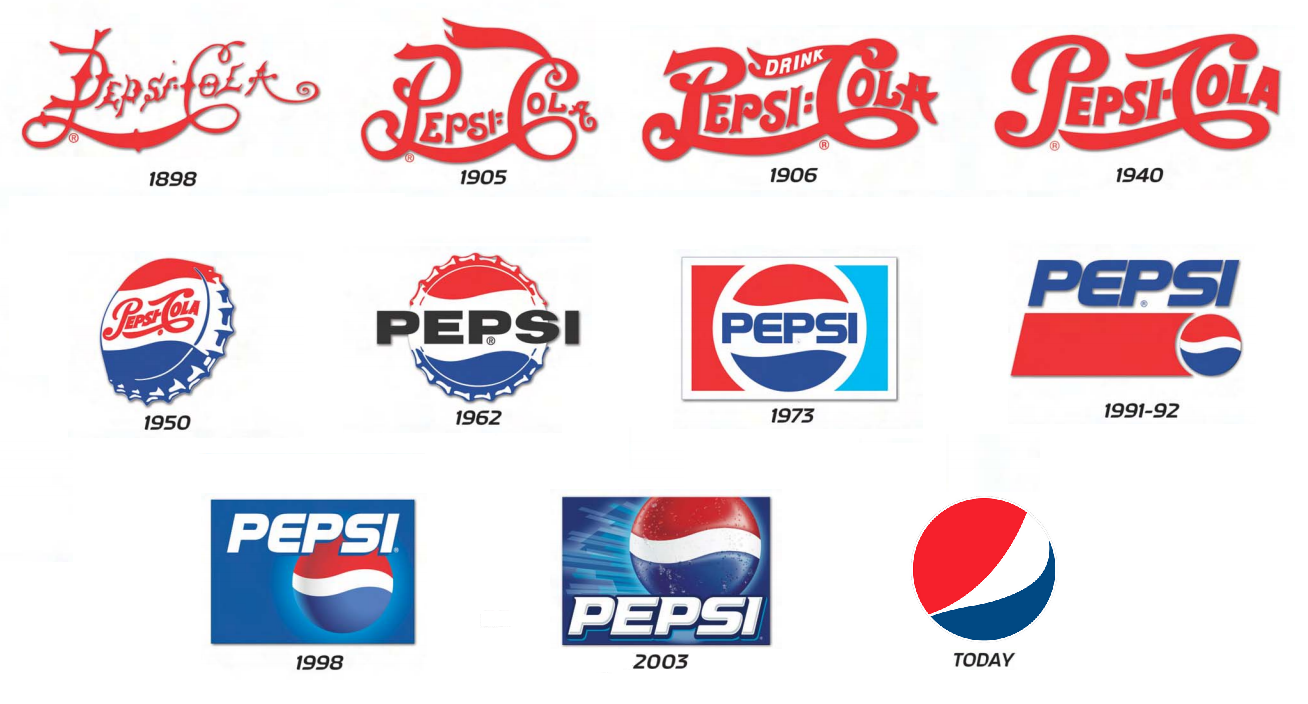
I then carried on looking on Walmart to see if there were any other possible products that I could rebrand. I found a product called Crisco, which I've heard about before on a movie called The Help. I think the branding for it is quite nice as it is, as I think the logo fits with the product as it's quite family orientated. I don't however like the packaging as it's very basic and doesn't really explain what the product does. I think it'd be a good product to package, however as I already think the logo is successful I don't want to rebrand, as there would'nt be much point. I did consider making a kind of logo-progression to show how the logo could develop, similar to the logo for Pepsi that was introduced subtley over multiple years, however I don't think there would be that much work and I'd like to challenge myself to something a little more complex.
I decided to carry on looking on Walmart and I came across the equivalent of ASDA's Smart Price brand, this one was called Great Value. I thought this could be quite interesting to rebrand as I think the logo could be improved greatly as the sans serif typeface looks very childish and I don't particularly like the fact that it's just type, I think it could work very well as some kind of illustration as a logo, similar to the branding of Tesco's own brand Everyday Essentials. I think the actual packaging of the products isn't very successful either, however I think it's good that they aren't all the same like ASDA's Smart Price is, as they have images of the product instead of just a plain product. I think it would be really interesting to give the brand a concept, for example 'you get what you pay for' and it would be a similar packaging, however each package would have a hole in with plastic in showing what the product actually is. Another idea would be to make the packaging appealing to a sepcific audience. I think as it's smart price, the people buying the product would generally be people considered lower class and people who want to be sensible with their money, for example students. I think it would be quite interesting to rebrand the packaging so that it is appealing instead of looking very cheap. An idea for this would be to create little character illustrations for the brand.
I asked my friend from back home about products that I could rebrand, as he went travelling around America for a month. He told me to look at Kraft Mac and Cheese, Arizona Iced Tea and Ramen Noodles. Firstly I looked into the Mac and Cheese. I think that the Kraft logo is very simplistic as it's mainly just type with a shape around it, however i think it is kind of effective, however I think that the packaging shows that the brand is more about the product and less about the brand - something that is relevant to my essay, however contradicts the point I try to get across. I personally think that the packaging is really successful as it is very obvious that it's a fun product and aimed at simplistic people.
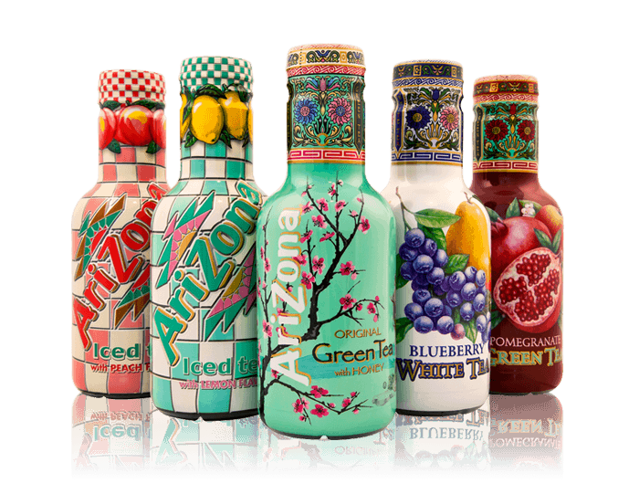
I then looked into Arizona Iced Tea. Personally I don't know why he told me to look into this as I think the packaging is really successful and each package of each drink is aimed at a different kind of person. All of the packaging looks really fun and makes me really want to try each drink and collect each bottle.
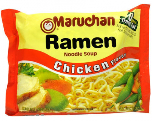
Finally he told me to look into Maruchan Ramen Noodles. I think this would actually be a really good product to rebrand as the packaging is awful because of the highly contrasting colours and the terrible typeface. I think the product would be a lot more sophisticated if the typeface didn't look so much like Comic Sans. I think the colour scheme needs altering also, as I like the use of the orange, however against a pale yellow it looks too striking.
Monday, 2 March 2015
OUGD401 Practical Proposal
What is the relationship between branding and the consumer self?
My main research so far has been about the success of branding over advertising and the brand loyalty that customers have towards specific brands.
I want to communicate that branding has a huge impact on how a product can be sold. To do this, I hope to either:
My main research so far has been about the success of branding over advertising and the brand loyalty that customers have towards specific brands.
I want to communicate that branding has a huge impact on how a product can be sold. To do this, I hope to either:
- Take a really poorly branded product and rebrand it completely.
- Rebrand a catalogue from the 1920's to work in our economy today.
- Rebrand a product from the 1920's so it could be sold successfully in society today.
- Rebrand an American product that isn't in the UK yet to work with UK branding principles.
Some sources of primary research could include:
- Create a questionairre for people to fill out on what they think makes a successful product that they would purchase.
- Look at the advertising/production/branding of existing products.
Some sources of secondary research could include:
- Looking at books and magazines about consumerism and advertising.
- Looking online at blogs.
- Maybe email a company asking how they market their product.
In order to come to a conclusion with my design work, I am going to try to stick to this schedule:
- Week 1: Decide on a direction to take my design work down.
- Week 2: Find a product / catalogue to rebrand.
- Week 3: Research into what makes a successful brand - colour theory? typography? Ask people which brands they think are most successful and why?
- Week 4: Idea generation - begin creating thumbnail logo designs / layout designs for catalogue.
- Week 5: Digitalise the successful designs - preferably after receiving feedback from a critique.
- Week 6: Create the product labels and actually create the product.
- Week 7: Carry out a survey to see if they product is more successful now.
- Week 8: Gather all research for hand-in.
OUGD401 Practice-Based Research Workshop (Study Task Five)
Content:
- Photography - To give an idea of how products opperate.
- Illustrations - To give an idea of how products opperate.
- Tag-lines - To make a brand memorable.
- Type - To inform.
- Logos - Make a brand recognisable.
- Colour - Brand identity, different colours symbolise different things.
- Symbols - Worldwide recognition.
Communication:
- Sophistication - Quality.
- Value - Basic brand ranges.
- Class - The idea that products improve status and happiness.
- Clarity - Create a clear message behind the brand / what the brand stands for.
- Fun - Images and colour suggest an effect of social interaction.
- Minimal - Slick brand image. High-end and easy to use.
- Personality - Creates a bond on a human level between the brand and the consumer.
- Benefits - Suggests buying things will have a positive impact in buyers life.
- Attractiveness - The idea people will be more desirable because of a product.
- Gender - Takes advantage of societies gender roles (femininity due to perfume etc.)
Analysis - To research and explore the reasons that similar products are successful and adapt my own designs to comete with these oppositions.
Research - Look into appealing brands and things like colour theory and peoples favourite colours to create an optimum desirable product and branding as a whole identity.
Evaluation - I can use evaluation to justify my informed design decisions and show how it further ensures the module question.
Testing - Testing my products success using surveys and other opinions will let me know if my final product has successfully proved my point.
Exploration - To explore a range of techniques and ways of working to come to a well executed conclusion.
Subscribe to:
Comments (Atom)