I started by looking online at the equivalent of ASDA in the US; Walmart. I found quite a few products that don't really exist in the UK, such as Butter Powder. This particular product is from a brand called Augason Farms. I decided to research into this brand. I think the branding is relevant for the product, however also not as the name of the brand and the logo suggests that the products are organic and free range, however the actual product is very processed. The products are all generally packaged in the same way - simplistic. I think the minimal style of packaging is very useful, especially in products like this as they are long-life products and they don't actually really need a brand, just a simplistic label. I think that Augason Farms realised this, however tried to make their products into a brand - which I think could've worked, however the style they have used is very unsuccessful. For example, I think the contrast of the logo against the blue works, however I really don't like the gradient used and I think the contrast of the red label and the blue is an eyesore and very ugly to look at. I also think the three, possibly four different typefaces used is disgusting. There's a script, a serif, a sans serif and possibly a condensed sans serif. There's an awful lot going on and the script typeface is not very legible. I think the use of the serif typefaces is effective, however put together with two different sans serif typefaces makes it look very outdated.
I considered rebranding the product, possibly aiming it at students living away from home, as a kind of food package that parents could send their children, however I asked a few people whether they would consider eating it and they all said no. I also looked into if the products in general are healthy, and it was a general no because they are all very processed products.

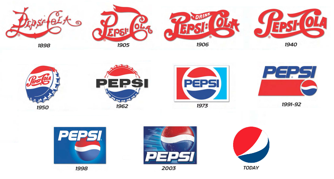
I then carried on looking on Walmart to see if there were any other possible products that I could rebrand. I found a product called Crisco, which I've heard about before on a movie called The Help. I think the branding for it is quite nice as it is, as I think the logo fits with the product as it's quite family orientated. I don't however like the packaging as it's very basic and doesn't really explain what the product does. I think it'd be a good product to package, however as I already think the logo is successful I don't want to rebrand, as there would'nt be much point. I did consider making a kind of logo-progression to show how the logo could develop, similar to the logo for Pepsi that was introduced subtley over multiple years, however I don't think there would be that much work and I'd like to challenge myself to something a little more complex.

I decided to carry on looking on Walmart and I came across the equivalent of ASDA's Smart Price brand, this one was called Great Value. I thought this could be quite interesting to rebrand as I think the logo could be improved greatly as the sans serif typeface looks very childish and I don't particularly like the fact that it's just type, I think it could work very well as some kind of illustration as a logo, similar to the branding of Tesco's own brand Everyday Essentials. I think the actual packaging of the products isn't very successful either, however I think it's good that they aren't all the same like ASDA's Smart Price is, as they have images of the product instead of just a plain product. I think it would be really interesting to give the brand a concept, for example 'you get what you pay for' and it would be a similar packaging, however each package would have a hole in with plastic in showing what the product actually is. Another idea would be to make the packaging appealing to a sepcific audience. I think as it's smart price, the people buying the product would generally be people considered lower class and people who want to be sensible with their money, for example students. I think it would be quite interesting to rebrand the packaging so that it is appealing instead of looking very cheap. An idea for this would be to create little character illustrations for the brand.


I asked my friend from back home about products that I could rebrand, as he went travelling around America for a month. He told me to look at Kraft Mac and Cheese, Arizona Iced Tea and Ramen Noodles. Firstly I looked into the Mac and Cheese. I think that the Kraft logo is very simplistic as it's mainly just type with a shape around it, however i think it is kind of effective, however I think that the packaging shows that the brand is more about the product and less about the brand - something that is relevant to my essay, however contradicts the point I try to get across. I personally think that the packaging is really successful as it is very obvious that it's a fun product and aimed at simplistic people.

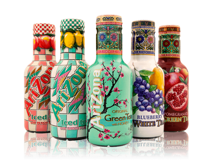
I then looked into Arizona Iced Tea. Personally I don't know why he told me to look into this as I think the packaging is really successful and each package of each drink is aimed at a different kind of person. All of the packaging looks really fun and makes me really want to try each drink and collect each bottle.
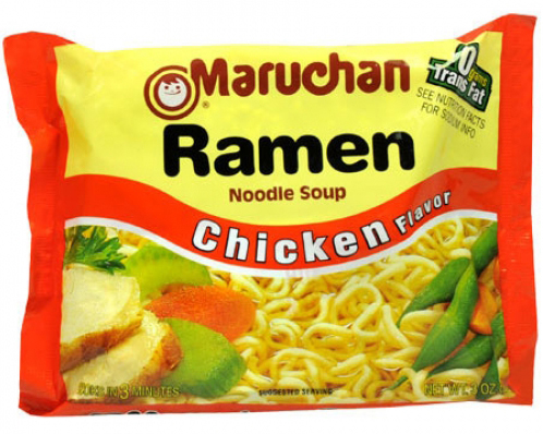
Finally he told me to look into Maruchan Ramen Noodles. I think this would actually be a really good product to rebrand as the packaging is awful because of the highly contrasting colours and the terrible typeface. I think the product would be a lot more sophisticated if the typeface didn't look so much like Comic Sans. I think the colour scheme needs altering also, as I like the use of the orange, however against a pale yellow it looks too striking.
No comments:
Post a Comment