Wednesday 11 January 2017

OUGD601 Design Boards


OUGD601 Evaluation

Overall, this module has been incredibly successful. I chose to answer the question 'to what extent is there a relationship between gender and visual culture?' and I believe I have answered this question thoroughly and to a high standard within both the written element and practical element of this module. This was a very interesting topic for me to research, which is one of the reasons I chose this question as I really enjoyed researching into the relationship between sex and visual culture for COP2. 

A strength of this project was definitely my own time management for the written element of the module, as I had a very tight project plan to work towards every week, which meant I was never overwhelmed with the amount of work I had to do to complete it. I also gave myself a lot of time over summer and in September to research before beginning the essay which was definitely beneficial as I had a very detailed outline of the content that my essay would involve.

However, a weakness of this project was the practical element, and this was due to poor time management. I thought I was really going to struggle to reach the word count of the essay, so for this reason I solely focused on the written element for most of the module, however it turned out that the written element was actually a lot easier than the practical.

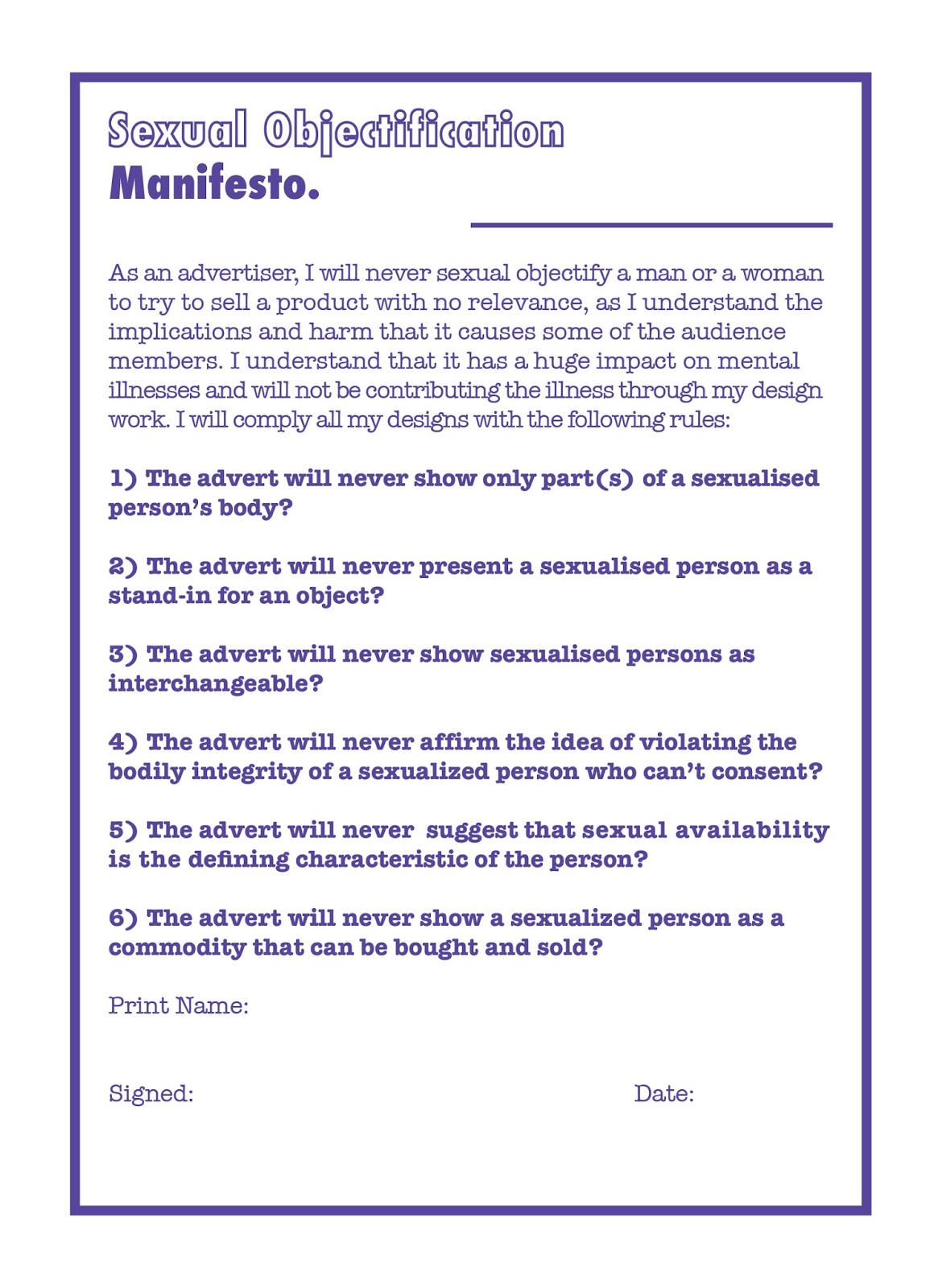
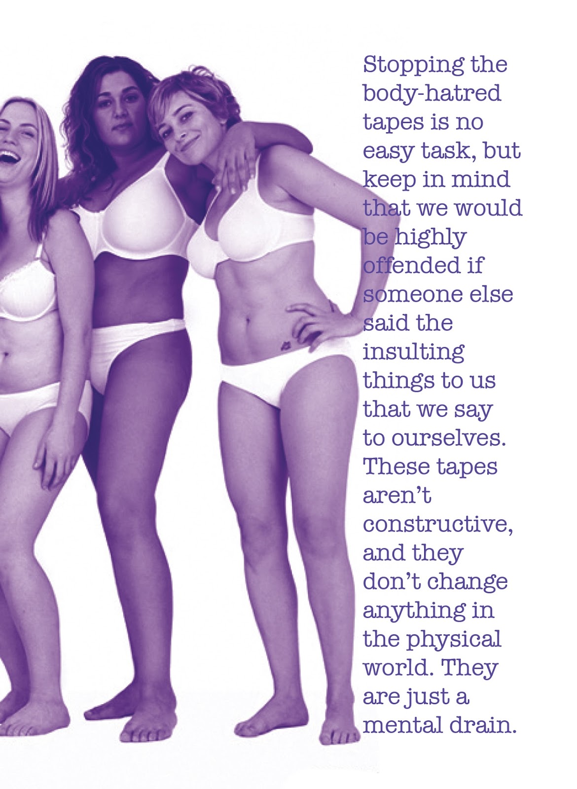
Having said that, I am really proud of the publication that I created as it's very informed by the research within the written element, something which is key to the time management of the written element, as I had a range of ideas and I had undertaken a lot of research.

A strength of this project was definitely my participating within the group critiques, and also making sure to ask for feedback off my own back instead of waiting for a group critique. I tried to really engage with them as it was something that I fell down on last year, and I believe it really helped me with both elements of my module. I also tried to give as much feedback as I could to other people to better their projects. 

Along with this, another strength of the module was engaging in tutorials and making sure that I had certain things ready to ask and discuss. This was very helpful and I think it definitely helped with both the written and practical element of the module. 

Another strength of the project was the printing method. As my time management of the practical work wasn’t quite as good as the written element, I didn’t have time to experiment with some of the things I had originally planned, such as scanning in the publication and printing it as a photocopy. This would’ve been really interesting to see, however it wouldn’t have had the overall affect that the final publication currently does, so for this reason I’m still very proud of the final publication, manifesto and posters.

A weakness of the module was definitely the printing of the publication. It really frustrated me that the publication wasn’t perfect as I was hoping it would be a design that would feature in my portfolio. However, I think it still can be, I will just have to reprint the publication in my own time, as the print room was too busy to get it reprinted in time for submission.


Overall, however, this module has been very successful and I have truly enjoyed engaging and researching into gender and visual culture. I think this is something I am going to start following more closely in my own time, as I couldn’t quite believe the statistics about sexual objectification, and I am definitely going to be on the look out for advertisements that don’t use the method of selling products through sex.

OUGD601 Synthesis

The written element of the module was explored to discover whether there was a relationship between gender and visual culture. The essay discussed different types of visual culture, such as the media and advertisements in relation to gender. This was then backed up by primary research about the advetisements that exist today. The conclusion of the dissertation was that there is a relationship between gender and visual culture, however it varies within the kind of visual culture. For example, ladies magazines are ladies magazines have a constantly conflicting ideology, however this ‘does not mean that there may not also be spaces for progessive ideas or cultural contestation’ (Gill, 2007, p.204). 

However, within advertising it was found that there is a huge relationship between visual culture and gender, as most advertisements that have existed in the past and exist in this day and age rely on gender to sell products, often by sexually objectifying women or dehumanisaton.

The aim of the practical element was to produce a publication that would aid graphic designers when creating advertisements to avoid sexual objectification by following six steps. The publication was aimed at graphic designers of all ages, and it was crucial that the publication was designed to appeal to all genders. The research into colour theory was hugely helpful when designing the publication as the concept was strengthened by appealing to both genders by contrasting the usual ideology that boys like blue and girls like pink. 

The overall aesthetic was also an important factor of the publication, as it was inspired by Riot Grrrl zines, and therefore followed a particular style of postmodern design. The typefaces also played a huge part in the aesthetic of the publication, as the bodycopy typeface used was incredibly similar to that used by Riot Grrrls in the 1990s.

Both the written and practical elements correlate to each other due to the content, as both elements explored both advertising and gender neutral advertising and both came to the same conclusion; that advertisements haven’t changed their ideology in around 50 years, and something has to be done about that. It was originally thought that the consumers ideology has to change in order for advertising to progress past using gender, however the first hand research undertaken discovered that many people’s attitudes have already changed, and therefore it’s down to designers and advertisers to attend to that.


To conclude, both the written and practical elements aimed to answer the question ‘is there a relationship between gender and visual culture?’. The answer is yes and the overall belief is that something needs to change so that all genders are included.

OUGD601 Mock Up of Gender Neutral Advertisements

As Simon has suggested that I should make some gender neutral advertisements as evidence that the publication would work and that advertisements don't necessarily need sex to sell, I have decided to create a advertisement for Bic razors, which was one of the first ideas I had on how to tackle the practical side of this project. 

As I have already done a lot of research into this, this should be quite simple to do as I already have a range of ideas. Below are some images taken of both a girl and a boy (I won't mention which is the boy and which is the girl!) 


To make it into an advertisement is very simple, as I already have the concept of 'No Nonsense'. Below is the final advertisement image. This was edited by getting rid of the background of the image and also making sure that there were no very obvious signs that point to which person is the boy and which person is the girl. I then found a stock image of a razor (I did try to take a photograph myself however the image quality was poor) and then adding the slogan and the logo.


OUGD601 Commercial Printing (Hypothetical)

The printing of the publication was successful due to the planning and digital print resource at university, however, if the publication was to be mass produced the publication would definitely be most cost effective if lithoprinting was used. Lithoprinting is a plate often made of aluminium that holds the image, and once the ink is applied only the image is printed. This would be a very cost effective method as only two colours were used through-out the making of this publication, posters and manifesto due to duotone. The stock was already very affordable, at less than 10p per sheet of A3, and the publication could also fit onto an A4 sheet without compromising the size of the publication, meaning the publication could be printed around 8 times a go using lithoprinting.

However, if this publication were to go to commercial printing, there would definitely have to be some changes made due to the faults that occurred when digital printing it.

OUGD601 Stock Choice for Publication, Posters & Manifesto

Originally I had planned to go to Fred Aldous and get some stock to print the publication, posters and manifesto onto, however after some consideration I have decided that this is a bad idea, as I want all of the practical work to be as close to how it would look mass produced as it possibly can be.

For this reason, I am going to use newsprint that is already available at university in digital print. The front cover of the publication is going to be pink stock that will be bought from the library, again keeping costs very low as it is very affordable stock. The only slightly expensive thing that will be used is for the other front covers; these will be clear acetate and coloured acetate.

Ideally, the square would be printed onto the blue acetate, however the acetate doesn't allow for printing onto and so for this reason the clear acetate beneath will give an idea of how the publication would look if the idea was possible.

As for the posters and manifesto, these will also be printed onto newsprint, however instead of using 100gsm stock, these will be printed onto 200gsm stock. This will keep the feel of the practical as a whole a constant and consistent.

OUGD601 Binding Method of Publication

a concertina booklet wouldn't be appropriate as the pagination is very different to the content that I have created. It also limits the number of pages and after a certain amount of pages can become very difficult to read easily.


This binding method wouldn't be appropriate either, as (I think) it's a Chinese stab bind and the pages don't open out fully - it wouldn't be appropriate as a few of the imagery that I have used is full bleed.


This binding method is a pamphlet stitch and would be a very appropriate binding method to use for this project as it is quick and easy to reproduce.


This is a perfect bind. This would also be an appropriate binding method, however the publication would lose the sense of magazine feel and would become a book. It would also mean that I couldn't use the cover that I plan to, so It won't be this binding method chosen.


As the publication is based on the Riot Grrrl zines, the most appropriate method of binding my own publication would be to staple bind it. However, as this won't be possible due to the thickness of the spine and number of pages, I think the most appropriate method of binding will have to be the next best thing, which is a pamphlet stitch. This is a good binding method as it's very easy to do and therefore if the publication were to be mass produced it would be possible to bind the publication a lot quicker than stitching any other kind of binding.

OUGD601 Photographs of Final Products

Below is the final printed publication that would be sent to designers as a guide to avoid creating advertisements that sexually objectify both men and women. The front cover of the publication is blue acetate. Ideally, the square would've been printed on the blue acetate, however the printer in university won't print onto this, so instead clear acetate is used below so you can see a similar effect. The second front cover is pink, and when the acetate is laid over the pink it turns to purple, which is one of the explorations I discovered when looking into colour theory. 


The publication on this page hasn't printed properly due to the printer being inconsistent with the printing, and an image from another page has managed to get onto this page, which was only noticed when fully bound. This wouldn't happen if the publication were to be printed professionally and bound professionally.


Below is another page that didn't bind very successfully once printed. Once the double page spread was cropped, the type was incredibly close to the edge of the page - something that shouldn't have happened due to the placement of the text on screen. This has prevented me from cropping the book down further, something planned on doing so that the pages would be neater.


This is one of the pages that was unsuccessful when printing - the type on the right page completely disappeared when printing, so this page had to be printed on a different printer, meaning the colours of the image are slightly different than how they should have been (see previous post about the nightmare I had when trying to print this particular spread).


Below is the manifesto that I created, that would slip into the back of the publication when the design companies receive the package. It's very minimal, as it is an important issue and it's an issue that shouldn't be dressed up. The design company would sign, date and send this form back (they would keep the publication and posters).


This is the final poster design. It uses a similar style to the publication influenced by Riot Grrrl zines, however has also been hugely influenced by Cosmopolitan magazine's style of making flowcharts. The idea behind this is that designers can check within two minutes if they have created an advertisement that sexually objectifies a person. 


Tuesday 10 January 2017

OUGD601 - Printed Publication Fiasco

After having successfully printed the publication, I thought it would be a good idea to get on with printing the dissertation, which is time consuming as it's out of university and it takes around an hour and a half. When I came back, dissertation in hand raring to go, I didn't expect to find that the digital prints weren't perfect at all!

Some of the pages had printed slightly off, some of the text was very close to the bleed and to make matters worse a page of content had decided to not print at all! (see image below).


I then tried to print it out on the printer in the graphic design room and... it's upside down!


Then I tried to print it 'correctly' and it had automatically scaled the spread the fit an A4 sheet of paper. However, it was close... so I tried it again and... you guessed it. Printer jam.


So I went to a different graphics room, however the printer was absolutely terrible quality. I had to try and find a technician to come fix it, and by the time I got back the printer was working again.


Trying to resolve this issue took out a huge chunk of the day. Firstly, I went back to digital print to see if I could get it reprinted during drop in, however the queue was gigantic and I was told to come back the next day, which is impossible due to the other practical elements I still have to complete (the advertisement).

Instead, it was decided that the only way to resolve the issue with the publication was to attempt to print off the page again on the printer in the graphic design room. Here are some of the failed attempts.

Finally, however, the printer did manage to print the page correctly and the publication will now be bound and the cover will be added.

It's quite frustrating as the publication looks a lot better on screen, however I'm glad that I managed to find some kind of solution to the issue as it would've been a complete waste if the printed copy was completely messed up.

Lesson learnt.

In future modules, I will make sure that I stay and bind the book / check over the prints whilst still in digital print to ensure that each page works successfully and doesn't need to be reprinted. It's also useful taking note that I will definitely be booking a printing slot again in the future as it was close to hassle free and everything that I wanted printing did get printed to a high quality.

Friday 6 January 2017

OUGD601 Manifesto Agreement

This particular part of the practical project was very simplistic to do, as I knew that I wanted to create it in the style of ordinary manifestos - so that it looks as though it is a binding contract and the person(s) that fail to comply with the rules will be punished.

For this reason, I made a very simple manifesto that fits inside the back of the publication. It is in keeping with the theme of both the posters and the publication, however, as the same shade of purple is used to make sure that each element is tied together. Below is the manifesto.


OUGD601 Final Poster Design

Below are the two final poster designs that I have created based on the idea of a magazines flow chart. They're successful as they're interactive and match with the theme of the publication as they are also created in the style of Riot Grrrl zines. They also feature some advertisements that sexually objectify both men and women so that the designer that receives the poster would have an idea of what to avoid. 
The poster designs were actually really time consuming to create due to the intricate nature of a flowchart, which is why I wish I had more time as I feel as though I definitely could've improved on the poster designs had I had more time.


However, overall I think they work really successfully as posters and are legible and easy to follow, however also have a post-modern feel to them, similar to Riot Grrrl zines.

OUGD601 Tutorial 5

In this final tutorial, Simon looked over the first and second chapters of my essay and gave me feedback which can be seen below. We also discussed the practical side of this project. I discussed the idea of creating an advert that is gender neutral, and also the final idea of creating a publication / manifesto that advertisers have to follow in order to not make sexist adverts. He thought that the idea was very good, so I am going to work on this further and develop it into a kind of campaign.


Thursday 5 January 2017

OUGD601 Concept of Posters

The concept of the poster designs is to give a quick overview of the content within the publication. To do this, the poster designs will be flow charts, which again related back to the written work as magazines are mentioned a lot within this. The posters will also be in the same style as Riot Grrrl zines, meaning the typeface American Typewriter and Futura Condensed Bold will be used, as previously explained when developing the publication. The colour scheme will also stay a constant - purple, symbolising the combination of both men (blue) and women (pink).

OUGD601 Flow Chart Research

A flowchart is a diagram that represents a pattern, workflow or process, showing the steps as boxes of various kinds and their order by connection with arrows or lines. This diagrammatic representation shows a solution model to a given problem.

They are used in designing and documenting simple processes or programs. They help to visualise what is going on and thereby help to understand a process, and perhaps find flaws and less-obvious features within it.

Wednesday 4 January 2017

OUGD601 Publication Feedback

Before printing the publication, I want to get some feedback from both Simon and my peers to see if there's anything that I should edit about the publication.

I emailed over a .pdf of the publication to Simon, below is his response.

'Hi Amelia,

This is an interesting solution. I think its effective and relevant in a sense but my question would be how do you know this will have any effect of change? I think you need to show the reader that your strategies can still have a positive impact in terms of sales and branding. 

I guess to be able to truly synthesise you need to demonstrate to the assessor that you are able to put these strategies into practice yourself. The booklet is a good addition but if you have time i think it would be worth while to produce some advert treatments that demonstrate your gender neutral strategies.'

I completely agree with Simon and I will definitely try to create an advert or two that follow the rules of what not to do from the publication.

I also asked a few of my peers on the table around me, their comments are as follows:

- I love it. The cover idea is really simple and also really effective and the concept behind it is very strong.

- I would check to make sure you can't find a higher quality image for certain pages, however other than that it's really successful.

- I like the colours used and the layout is really strong although I'm not sure what riot girl is.

All these comments will be taken on board and before printing I will try to make amendments and improve the publication further.

Within this little group critique I was also asked if I had any poster ideas, to which I hadn't even began thinking of. It was suggested to me that I should make a kind of flowchart for designers to follow that will substitute as a poster design, which I think is a brilliant idea as zines and magazines often have flowcharts, and therefore the poster will be a lot more relevant and in keeping with the zine idea of being based on Riot Grrrls zines.

Tuesday 3 January 2017

OUGD601 Chosen Print Method

The publication is going to be printed in the digital print room on the 10th January at 10am. I booked this slot around a month ago and have worked hard to get the practical project ready for this date. The cover of the publication will be purple to echo to colour theory used throughout the publication. By this point, I will also hopefully have finished some poster designs and also created a manifesto that would slip into the back of the publication and would be sent back signed and dated by designers and design agencies.

OUGD601 Print Method Research

Ideally this publication would've been photocopied, as this is the print method that Riot Grrrl zines used, however I don't want to completely copy everything about Riot Grrrl zines as it has been around 30 years since then and technology has developed hugely. For this reason I think it would be appropriate to use a new technology, which will symbolise the fact that advertising has changed since the past, however not necessarily for the better. Advertising quality has also changed, which will also be symbolised. Digital photography and Photoshop exist which emphasise the perfection of models even more than in the past.

OUGD601 Final Publication

Below is the final publication design, 'Sexual Objection, The How NOT To' Guide, which is created in the style of Riot Grrrl zines.


Thoughts:

This publication has been very difficult to make, a lot more difficult than originally thought, due to the style, because as a designer this isn't a style I have ever created work in before, however it had to be made in this particular style as a tribute and follow on from the Riot Grrrl zines. Of course it is different from the Riot Grrrl zines, as it is more up to date - it uses coloured ink instead of coloured stock and won't be printed through photocopying, and it will have a real cover on to protect, as I wanted the publication to stand out and be kept pristine by the advertisers who in theory would receive a copy.