Thursday 30 April 2015

OUGD401 Packaging Development

After looking at some packaging, I have decided that I want to create a wrap around package and brand Spam as actual meat. This would also increase the profit margin for Spam as it will have to be kept in the fridge/freezer, and therefore people will buy it a lot more often.

THINGS TO INCLUDE ON SPAM PACKAGING:

200g

Ingredients: Pork (89%), Salt, Starch, Water, Ham (2%), Sugar, Stabiliser, Trisodium Diphosphate, Flavourings, Antioxidant: Sodium Ascorbate, Preservative: Sodium Nitrate.

May contain traces of milk

Gluten Free

Store in cool, dry place. Refrigerate after opening, in a non-metallic container and consume within 48 hours.


Best before: 05/05/2015

Sunday 26 April 2015

OUGD401 Packaging Research

Before designing packaging, I thought I would look into packaging that already exists. I found this packaging below, which I think is really successful as the packaging looks a bit like sweets, and it's really eyecatching and makes me want to buy it, even if I'm not really 100% sure what it is.


I then found this packaging below. I think it's really successful as it's obvious that the sandwiches are aimed at children as each package is given a character. It's also successful that it's smart packaging as the sandwiches can be seen through the mouth of the creature. It's also a nice added touch that the creatures have sticky out ears, as it would make the packaging stand out on the shelf even further. 


I found this packaging for Gillette which I think is really successful as it is in black and white, and therefore seems really old and traditional. It's successful as a sans serif typeface is used which gives the product a modern style, but also suggests that the product has been around for years and is still very successful.


I found this outside packaging for a map from Manhattan to New York which I think is very simplistic but effective as it's minimal and therefore gives an essence of the map - it's easy to follow and to be informed by. I think the fact that the type is all central is effective as it makes it readable on the wrap around cover.


This is another example of smart advertising. I'm not really sure what the product is, however I think the packaging is really clever and well thought out, and it makes me want to buy the product anyway just to show people. This is an example of the brand being more important than the product. 


This is a similar idea I had for when I considered rebranding Good Value's brand by Walmart. It shows the product through the packaging, which shows that you get what you pay for. I think this branding is the opposite of what I want to put across with my branding, however, as I'm trying to get the message across that it's more about branding than the actual product. 


I then decided to look into packaging that could be specific to Spam. I found this tin that is designed really nicely, however I think I want to completely change the packaging of Spam from a tin to something else, maybe the package that meat comes in as I think it will make it look more expensive and desirable.


I decided I would look into the packaging for specifically meat. I found this below, which I think is unsuccessful as it looks quite cheap and the typeface is very bold and in your face which is unappealing. It looks like a very post-modern style because it's really busy.


I then found this packaging for the same product by the same brand Pravo Domace. I think this design is a lot more successful as it is less cluttered, however I don't think the photograph is relevant or neccessary and I still don't like the typeface used.


I then found this packaging which I think is really successful and would also be a good purchase as it would fit in the freezer/fridge easier as it's in a flexible package. I think this would be a good thing to consider, however I'm not too sure how I'd go about making a mock up, so I'm just going to design the outside cardboard packaging.


I think this packaging is really successful in a similar way to the pasta, as it shows that you get what you buy in a smart way. However, it isn't exactly necessary for meat as normal packaging shows the meat inside anyway, which is good as you can be picky, as most people are when it comes to meat. 

Saturday 25 April 2015

OUGD401 Logo Tests

Before carrying on, I wanted to check that the logo would be transferable onto objects. To do this, I used a book I bought around a year ago called 'Blank Slate'. It is basically a book full of stock images to put your own designs on and you also get a cd with high quality images on. I tried to use objects that could be relevant for the brand, such as folders, letters, plates, tins, bags and uniform. 


I think the logo is definitely successful so now I am going to proceed with packaging the product. 

Wednesday 22 April 2015

OUGD401 Further Logo Development

I experimented with some colour schemes even though I knew that I wanted to use the colour blue, just to make sure that I couldn't find a more effective colour. I didn't which I was happy with because I knew that a dark blue would be effective for the brand, as it has been for years. I did like the last colour used, however I don't think it works very well and I don't think it'll work when contrasted with the colour of the meat.


To develop my logo even further, I wanted to create a texture that the illustrations in my logo would fluently have. To do this, I created a glitchy pattern using illustrator and overlayed it ontop of the logo design. I had to do this in sections as otherwise it took far too much of the logo design away. This is my final logo design which I think is really effective and traditional, and therefore relevant to the essence of the brand.


OUGD401 Colour Scheme / Swatch

For my colour scheme, I knew I wanted to change it quite a bit from the original Spam colours used on the packaging, as I think the colours make the product quite cheap, similar to Kraft's Mac & Cheese, although in actual fact Spam is quite expensive for a tinned food. Below are the original spam colours and a colour swatch.


I decided that I should look into colour theory and see what the colours actually mean. I created this colour chart because I thought it would be very useful for this project and future projects when I look into colour theory. I found out that the colour blue suggests loyalty, which is relevant for the product as it has been around since 1937, so a lot of people must buy it. The colour yellow, however, suggests cowardice. I think this could be relevant for the company and their packaging, as the packaging and logo hasn't ever been changed.


I created my own colour swatch for the brand. I knew that I wanted to get rid of the colour orange and mainly focus on the colour blue to show brand loyalty. I also added some colours that looked effective together. I imagine the grey to be silver, however obviously I can't show this on the computer. I also added black and white, as all of the colours work really well together as they make the blue stand out a lot. I changed the shade of blue from the original Spam packaging, as personally I think the blue that they use is very bright and makes the product look cheap. I decided to use a darker, duller shade of blue, which I think shows sophistication with the other colours. 

Tuesday 21 April 2015

OUGD401 Logo Development

Before jumping straight onto a computer to design my logo, I decided I would start by drawing out some thumbnail ideas, as I've found this really useful in the past for other modules, such as PPP. I starting by doing a mind map of the current logo, which I think I will find helpful as I want to steer clear of creating a similar logo. I thought the logo was simple, boring, childish, cheap, that the colour scheme was awful and this specific serif typeface was ineffective.

I then created a mindmap of what I want my own logo to be. I decided I wanted it to be traditional, have an expensive feel, be classic, simplistic, elegant, have a nicer colour scheme and have a different audience/market.


I then started designing some icons and logo ideas of my own. I started with the obvious responses - pig noses, trying to fit the work 'Spam' into a pig nose and just simplistic typography. I then decided to try to create a logo within a circle, as I thought it reminded me of the branding of animals which could work. 


I carried on designing logos in a circle, however I didn't really think they were working very effectively. I then started playing around with the idea of using a silhouette of a pig. I think this could definitely be effective as it would make the product seem more like meat than it actually is, and therefore it would be less processed and better for the buyer.


I then decided to go back to playing around with typography. I don't think any of these ideas are very successful as they're quite simplistic and not very relevant to the brand - although they may work better when they look neater designed on Illustrator.


I then went back to the idea of the pig nose. I thought this might work in a circle with type, although I thought it would be quite hard to tell as a thumbnail and I would have to actually create it on Illustrator to know for sure.


I have decided I have done a lot of logo development and I think that some of the logo designs could definitely be successful for the brand. I am now going to create some of the ideas using Illustrator. I think the design below is ineffective as it looks very formal and doesn't look too relevant - although it could work on packaging.

I think this logo design is actually nice as it's really simplistic.
I think this logo is too similar to the original, however it is in a nicer typeface so could be effective.
This logo could definitely work, however the typeface didn't fit very will in the circle and therefore would need work to make it look central.
I actually really like this logo design. It's incredibly simple and reminds me of the branding of animals. I think it would look really nice with a texture over the top.
I like this logo design too, it's simple and also reminds me of animal branding. The only problem with it is that it looks slightly like an important form that people have to fill out.
I really like this logo design as the inner circle breaks up the block colour and the typeface looks a lot more effective in a circle. It also works as the pigs back is in the same circular shape.
I like this logo design, however, again, the work Spam looks very out of place.
I tried to develop the first logo that I liked by making it look more like branding, but now I think it is too busy and therefore ineffective.
I really like the simplicity of this logo design. I think it works very well in a rectangle and there is a good use of negative space.
I tried to create a kind of spam burger logo design, however I don't think it's very nice as it's busy and not spacious enough.
I think the simplicity of this logo is really effective and the typeface fits really well with the circles.
I really like this logo design as it reminds me of animal branding and it's very simple and elegant.
I think this logo design is effective also as it reminds me of a Spam burger, something that the actual spam packaging has an image of on.
I don't think this logo is very effective as the type doesn't fit very well, however I like the idea of it being a kind of label.
I don't think this is effective as the type seems too close together and it's very condensed.
I really like this logo design and I think I want it to be my final design as it's simple, informative and basically explains what the product is. I did it on a slant for some reason which I think is ineffective, however I am going to recreate it so that it is straight.
This is my final logo design and I'm really happy with it. I think the typeface works really effectively with the block colour as it breaks up with block colour so it looks like there is more negative space than there actually is. I think it's good as it doesn't look too busy, although doesn't look too simple either.


Tuesday 7 April 2015

OUGD401 Specific Brand Research

I then decided that I should look into relevant branding. To do this, I simply looked online at packaging for meat (Even if Spam is only 90% meat). The first packaging I came across was a brand called Zamora, who specialise in sausages. I think the packaging is incredibly effective as they're really interesting to look at and each design tells a kind of story. I think the use of loose illustrations in these designs is incredibly successful as it makes them very appealing. I think the colour scheme for the packaging is also very successful as they would be very cheap and easy to reproduce.


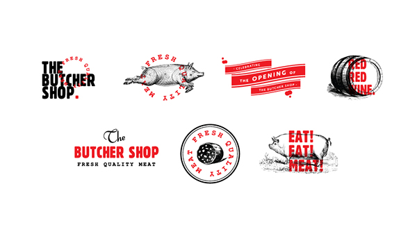
I then found the icons below designed for The Butcher Shop. I thnik the illustrations with the overlayed type is effective as it makes them really interesting. I don't particularly like the colour scheme, however, as I think it looks quite gruesome, as it reminds me of blood, which would make me think about the slaughter of animals, which definitely would'nt make me want to buy the product. I think illustrations could work for Spam, however I think it'd be false advertising as it's not 100% meat.


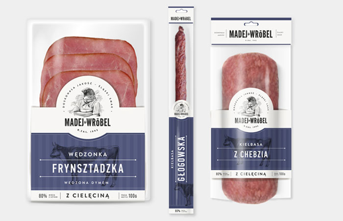
I found this design below for the packaging which I think is incredibly slick because of the contrast of the meat and the colour scheme - it is obvious that this was definitely considered before packaging. I think the illustrative logo is also successful as it looks very quirky and original. I think the typeface used is very successful as it makes the branding look very modern and new. I also really like the colour scheme and I think I want a similar colour scheme for my own branding.


I really like this simplistic logo design for a restaurant called Meat & Bread. I think the fact that it is just type is very effective as it's legible and the use of negative space is successful. I also like the fact that the logo is printed on textured stock as parts of the logo are missing - I think this is something I want to consider for my own branding.


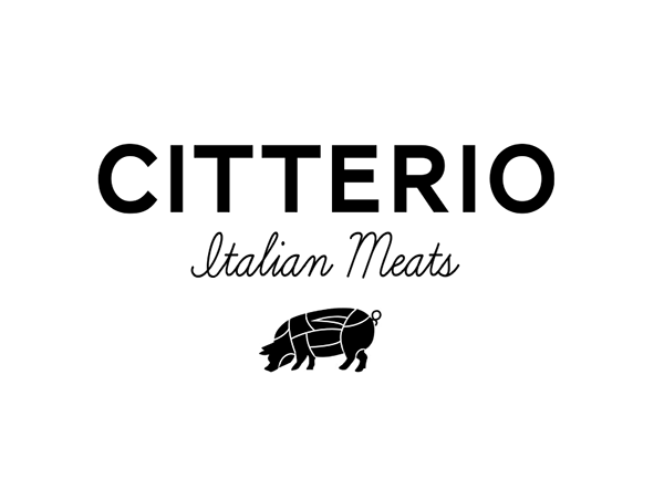
This is a logo design for Citterio Italian Meats. I think the use of the sans serif is effective, however I really dislike the script typeface as it isn't very easy to read and I think script typefaces should be steered clear of, especially for branding of meat. I think the sans serif is effective because it seems relevany - it reminds me of branding animals. The illustration is also effective as it shows each section of the pig that the company sells.


Finally, I found this packaging below which personally I love. I think it's incredibly simplistic style works really well and there isn't a lot of type used. I think this is good as it shows that the product is very important as well as the brand, as the brand is very obvious, however the quality of the meat is too. I also like the way they show which part of the animal is used by using illustrations. This is good as it is universal and anyone from any country would know which part of the animal they were purchasing.