I then decided that I should look into relevant branding. To do this, I simply looked online at packaging for meat (Even if Spam is only 90% meat). The first packaging I came across was a brand called Zamora, who specialise in sausages. I think the packaging is incredibly effective as they're really interesting to look at and each design tells a kind of story. I think the use of loose illustrations in these designs is incredibly successful as it makes them very appealing. I think the colour scheme for the packaging is also very successful as they would be very cheap and easy to reproduce.

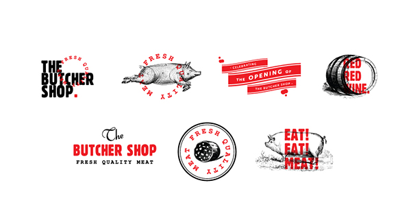
I then found the icons below designed for The Butcher Shop. I thnik the illustrations with the overlayed type is effective as it makes them really interesting. I don't particularly like the colour scheme, however, as I think it looks quite gruesome, as it reminds me of blood, which would make me think about the slaughter of animals, which definitely would'nt make me want to buy the product. I think illustrations could work for Spam, however I think it'd be false advertising as it's not 100% meat.
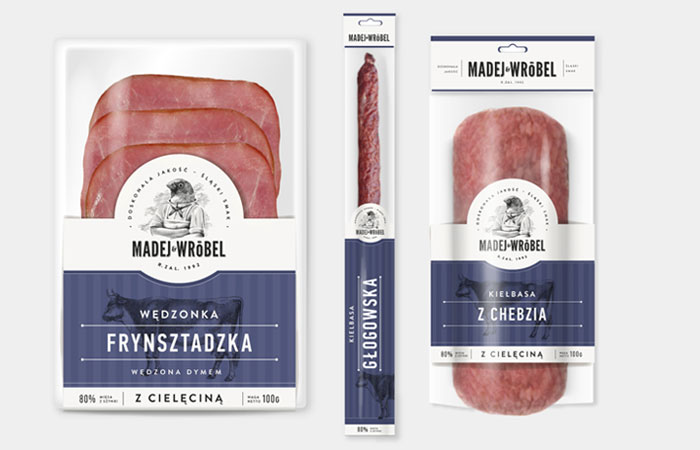
I found this design below for the packaging which I think is incredibly slick because of the contrast of the meat and the colour scheme - it is obvious that this was definitely considered before packaging. I think the illustrative logo is also successful as it looks very quirky and original. I think the typeface used is very successful as it makes the branding look very modern and new. I also really like the colour scheme and I think I want a similar colour scheme for my own branding.
I really like this simplistic logo design for a restaurant called Meat & Bread. I think the fact that it is just type is very effective as it's legible and the use of negative space is successful. I also like the fact that the logo is printed on textured stock as parts of the logo are missing - I think this is something I want to consider for my own branding.

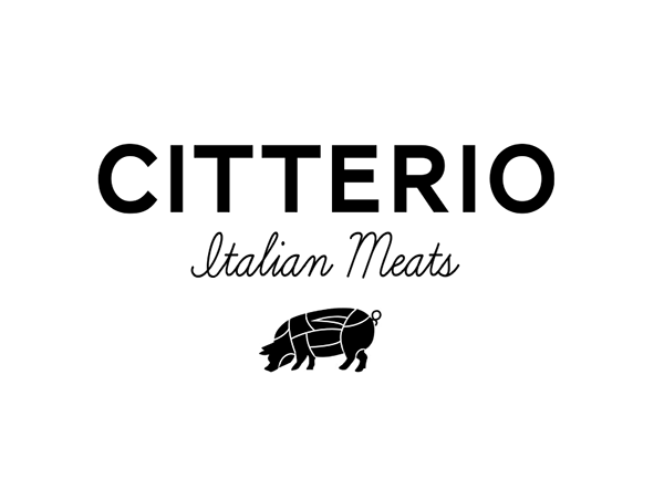
This is a logo design for Citterio Italian Meats. I think the use of the sans serif is effective, however I really dislike the script typeface as it isn't very easy to read and I think script typefaces should be steered clear of, especially for branding of meat. I think the sans serif is effective because it seems relevany - it reminds me of branding animals. The illustration is also effective as it shows each section of the pig that the company sells.
Finally, I found this packaging below which personally I love. I think it's incredibly simplistic style works really well and there isn't a lot of type used. I think this is good as it shows that the product is very important as well as the brand, as the brand is very obvious, however the quality of the meat is too. I also like the way they show which part of the animal is used by using illustrations. This is good as it is universal and anyone from any country would know which part of the animal they were purchasing.

No comments:
Post a Comment