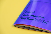
Below is the final printed publication that would be sent to designers as a guide to avoid creating advertisements that sexually objectify both men and women. The front cover of the publication is blue acetate. Ideally, the square would've been printed on the blue acetate, however the printer in university won't print onto this, so instead clear acetate is used below so you can see a similar effect. The second front cover is pink, and when the acetate is laid over the pink it turns to purple, which is one of the explorations I discovered when looking into colour theory.
Below is another page that didn't bind very successfully once printed. Once the double page spread was cropped, the type was incredibly close to the edge of the page - something that shouldn't have happened due to the placement of the text on screen. This has prevented me from cropping the book down further, something planned on doing so that the pages would be neater.
This is one of the pages that was unsuccessful when printing - the type on the right page completely disappeared when printing, so this page had to be printed on a different printer, meaning the colours of the image are slightly different than how they should have been (see previous post about the nightmare I had when trying to print this particular spread).
Below is the manifesto that I created, that would slip into the back of the publication when the design companies receive the package. It's very minimal, as it is an important issue and it's an issue that shouldn't be dressed up. The design company would sign, date and send this form back (they would keep the publication and posters).
This is the final poster design. It uses a similar style to the publication influenced by Riot Grrrl zines, however has also been hugely influenced by Cosmopolitan magazine's style of making flowcharts. The idea behind this is that designers can check within two minutes if they have created an advertisement that sexually objectifies a person.


No comments:
Post a Comment